Black and White vs Color
My Preference
Black and white vs color? That is the question. If you’ve followed this blog or my artwork for any period of time, you know that my preference is black and white. For some reason, it always has been. And I do believe it always will be.

Smiley face – It’s yellow for a specific reason!
Why, though? You will find an endless number of studies on how the human brain is affected by black and white vs color. And yes, it’s been documented that colors have a much wider effect via moods, chemical and hormonal shifts, and other nifty stuff within the human body. Colors such as red for example, have a direct effect on the brain. It’s been associated with heightened aggression, anger, love, and arousal. While blue on the other hand, in small amounts is associated with having a calming and soothing effect. Too much blue however, can lead to depression and sadness. Ever wonder why the smiley face is yellow? Yellow releases serotonin in the brain, which makes you feel happiness.

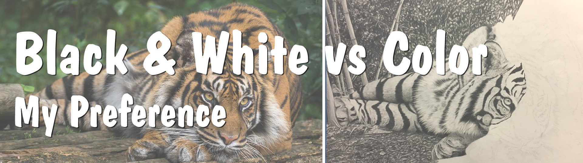
Shima – B&W, 2016 vs Color Pencil study
And most would agree that a color photograph is more realistic than a black and white one. That may be true in the sense that we see in color. However, for me and my artwork, the opposite seems to happen. My black and white drawings have been called hyperrealism or photorealism by many. It’s flattering. It’s also something I’ve never been able to achieve with color…yet. I will never say never!
Black and white is comfortable for me, like an oversized pair of sweats, fuzzy socks, or a warm blanket. It’s familiar to me, like a dear old friend. Color on the other hand, often eludes me. I am uncomfortable with it and sometimes overwhelmed by it. For any art students out there, there is a class that was required (back in the day, anyway)…color theory. Somehow I escaped having to take it, but now I wish I had. Better to have gotten the fundamentals when I was young and impressionable!

Blue and Yellow Don’t Make Green, by Michael Wilcox
There is a book that I own however, that I vow to go through one day, cover to cover…Blue and Yellow Don’t Make Green, by Michael Wilcox. That’s right. What you were taught as a child about mixing colors isn’t entirely true. But more on that in a later post.
You see, I understand the basics. But when it comes to actually working color, it’s a different thing altogether. Black and white just falls into place for me and I’ve been told by some that they don’t even miss color with my work. So over the years, I’ve thought, why bother? Well…for the challenge maybe. To get out of my comfort zone, perhaps, to stretch my abilities, and to conquer my mild fear of it. And why not? It would be awesome to be able to create photorealistic drawings in black and white and in color! Another skill to add to my repertoire. But for now, when it comes to black and white vs color, my preference remains…black and white.
![]()
If you like what you’re reading, PLEASE subscribe and share with someone you think might like it too!
This blog contains Amazon Affiliate links. As an Amazon Associate, I may earn from qualifying purchases.

Recent Comments